
Block & Layout Showcase
A living catalogue of every block type and layout pattern this site can build programmatically. Each section is labelled — copy the one you need, swap the words, push.
HEADINGS — the type scale
Heading 1
Heading 2
Heading 3
Heading 4
RICH TEXT — paragraphs, emphasis, links
Body copy can carry bold and italic emphasis as well as an inline link — all inside a single rich-text block.
A second paragraph proves multi-paragraph flow within one block. This is the workhorse element — most page copy is one of these.
LISTS — unordered & ordered
Unordered
- First point
- Second point
- Third point
Ordered
- Step one
- Step two
- Step three
QUOTE — pull-quote / blockquote
“Whoever controls the section JSON controls the story.”
BUTTONS — size variants
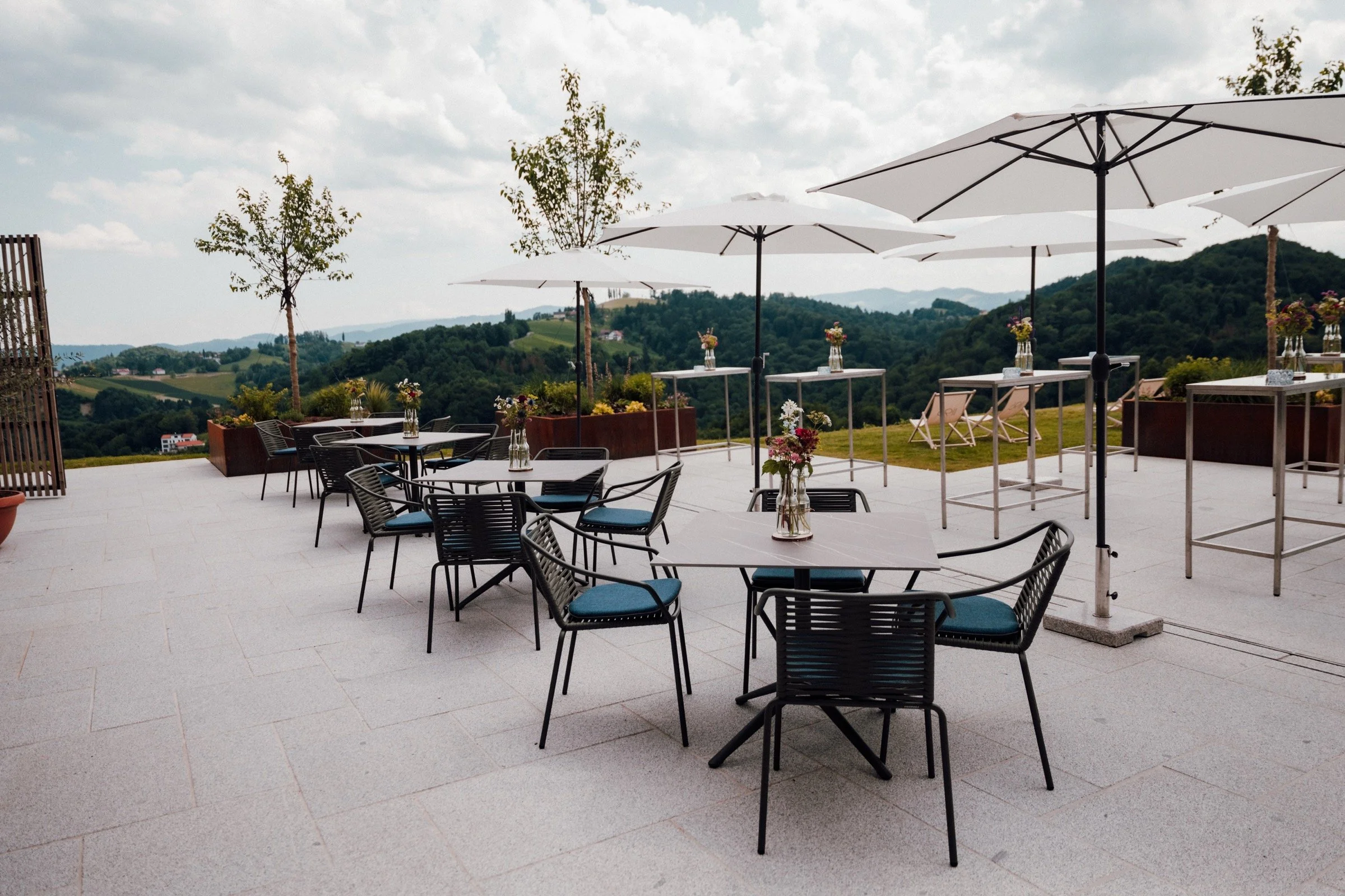
IMAGE — a single image block
TWO COLUMNS — equal halves (stack on mobile)
Left
Two blocks share one desktop row by living in different x-ranges at the same y.
Right
On the 8-column mobile grid they stack full-width — each block has its own per-breakpoint layout.
THREE COLUMNS — thirds
One
Left third.
Two
Middle third.
Three
Right third.
LAYERS — overlapping blocks (z-index), text scrim for contrast
Over the image
A higher zIndex with an overlapping y-range stacks this text above the image — Fluid Engine "Layers".
SPACING & HEIGHTS — the knobs
Top/bottom breathing room comes from leaving empty grid rows above the first block and below the last (this generator insets 3–5 rows each end). Section-wide gaps are gridSettings.rowGap / columnGap (11px). Section height follows the grid row count; section-height--custom + customSectionHeight 0 hugs content. Each section sets its own sectionTheme — this page steps through white, white-bold, light-bold, black and dark-bold.
A real-world hero
Heading, body and a call-to-action over a full-bleed background image with an overlay for legibility — the most common page opener.